library(dplyr)
library(tidyr)
library(tibble)
library(stringr)
library(readr)
library(purrr)
library(tidytext)
library(quanteda)
library(word2vec)
library(Rtsne)
library(ggplot2)
library(digest)

source("R/inaugural-corpus.R")
source("R/lesson-figures.R")

metadata <- read_csv(
  "data/word2vec/word2vec-metadata.csv",
  na = character(),
  col_types = cols(
    field = col_character(),
    value = col_character()
  )
)
metadata_values <- setNames(metadata$value, metadata$field)

model_path <- "data/word2vec/inaugural-word2vec.bin"
model_sha256 <- digest(file = model_path, algo = "sha256")
expected_model_sha256 <- metadata_values[["sha256_model"]]

stopifnot(
  identical(model_sha256, expected_model_sha256)
)

word2vec_model <- word2vec::read.word2vec(model_path)
embedding_matrix <- as.matrix(word2vec_model)Projecting word vectors onto a map
Measure what the picture keeps and what it loses
information visualization
word embeddings
dimensionality reduction
Learn how PCA and t-SNE draw word embeddings in two dimensions while preserving only part of the original neighbourhoods.
Theo wants to show a small word-vector model on one slide. A scatterplot feels like a map, and maps invite stories.
This picture needs a warning label. Each word begins as 50 numbers. A two-dimensional drawing can keep some nearby neighbours and lose others.
Word embedding visualization draws word vectors as points by projecting many numeric dimensions into two. The plot is a question to check, not a finding about topics, clusters, or meaning.
TipWhat you will learn
This lesson shows how to:
- verify the pinned inaugural word2vec model before loading it;
- scale each word vector to length 1 so straight-line distance ranks neighbours the same way as cosine similarity;
- choose a stated set of frequent words to plot;
- mark, in the plot itself, which nearest neighbours a projection keeps;
- compare PCA with t-SNE, and two t-SNE seeds, by neighbour preservation; and
- avoid reading clusters, gaps, sizes, and axis directions as evidence.
Load and verify the pinned model
The model comes from lesson 61. It is deliberately small: the metadata records 134,419 cleaned training tokens and a 50-dimensional skip-gram word2vec fit. In lesson 61, even the easy pair freedom / liberty landed below the median of all pairwise similarities, so this lesson measures whether the picture keeps the model’s neighbours. It does not claim the model learned reliable meaning.
| Model check | Value |
|---|---|
| training tokens | 134419 |
| vocabulary rows | 2709 |
| dimensions | 50 |
| algorithm | skip-gram |
| model SHA-256 matches metadata | TRUE |
The fingerprint check fails closed if the binary changes. Rendering does not train, download, or update a model.
Choose the plotted words
The full saved vocabulary has 2,709 rows, including the trainer’s </s> marker. This page plots the 300 most frequent training words that also have vectors. Changing the subset can change the projection.
paragraphs <- inaugural_paragraphs()

training_text <- tokens(
  str_to_lower(paragraphs$paragraph, locale = "en"),
  remove_punct = TRUE,
  remove_numbers = TRUE
) |>
  vapply(paste, character(1), collapse = " ")

training_frequencies <- tibble(text = training_text) |>
  unnest_tokens(word, text) |>
  count(word, sort = TRUE, name = "cleaned_paragraph_count") |>
  filter(word %in% rownames(embedding_matrix), word != "</s>")

selected_words <- training_frequencies |>
  slice_head(n = 300)

selected_embeddings <- embedding_matrix[selected_words$word, , drop = FALSE]
normalized_embeddings <- selected_embeddings / sqrt(rowSums(selected_embeddings^2))| Word | Count in cleaned paragraphs |
|---|---|
| the | 10003 |
| of | 7057 |
| and | 5300 |
| to | 4523 |
| in | 2746 |
| a | 2244 |
| our | 2176 |
| that | 1783 |
| we | 1713 |
| be | 1490 |
| is | 1428 |
| it | 1395 |
The 300 plotted words range from 49 to 10,003 uses. The count column is an approximate training count rebuilt from the cleaned paragraphs with tidytext’s tokenizer, not a byte-for-byte count from word2vec’s internal splitter.
Dividing each vector by its length, a step called L2 normalization, makes every row length equal to 1. On rows of length 1, straight-line (Euclidean) distance ranks neighbours the same way as cosine similarity, the measure used in lesson 61. The neighbour lists below are computed that way in all 50 dimensions, and the same kind of distance is then measured in each two-dimensional drawing.
Decide what counts as a kept neighbour
A plot of words is only useful if nearby points were nearby in the model. For each word, the code below finds its 10 nearest neighbours among the 300 plotted words, measured in all 50 dimensions, and later its 10 nearest points in a two-dimensional drawing. A neighbour is kept when it is also among the word’s 10 nearest points in the drawing. A neighbour that is not kept may sit just outside that top ten or far away; the count does not say which.
nearest_by_similarity <- function(matrix, k = 10L) {
  similarity <- tcrossprod(matrix)
  diag(similarity) <- NA_real_
  t(apply(
    similarity,
    1,
    \(values) names(sort(values, decreasing = TRUE))[seq_len(k)]
  ))
}

nearest_by_distance <- function(points, k = 10L) {
  distances <- as.matrix(dist(points))
  diag(distances) <- Inf
  t(apply(
    distances,
    1,
    \(values) names(sort(values))[seq_len(k)]
  ))
}

full_space_neighbours <- nearest_by_similarity(normalized_embeddings, 10L)

label_words <- c(
  "government", "people", "freedom", "union",
  "peace", "constitution", "war", "america"
)
The eight words in label_words get their own panel in each figure below. They are landmarks for matching the two figures by eye, not cluster names.
Project with PCA
PCA, short for principal component analysis, finds the directions along which the normalized vectors spread out most. The plot uses the first two.
pca_fit <- prcomp(normalized_embeddings, center = TRUE, scale. = FALSE)
pca_variance <- pca_fit$sdev^2 / sum(pca_fit$sdev^2)
pca_scores <- pca_fit$x[, 1:2, drop = FALSE]

# A component's sign is arbitrary, so fix it with named words before plotting.
if (pca_scores["government", "PC1"] < 0) {
  pca_scores[, "PC1"] <- -pca_scores[, "PC1"]
}

if (pca_scores["freedom", "PC2"] < 0) {
  pca_scores[, "PC2"] <- -pca_scores[, "PC2"]
}

pca_neighbours <- nearest_by_distance(pca_scores, 10L)
The first two components hold 23.9% of the variance in the normalized vectors. The rest is invisible in this plot.
The function below turns a set of two-dimensional coordinates into one panel per landmark word. In each panel, every 50-dimensional neighbour of the landmark is marked as kept or not kept, and the panel title counts how many were kept.
anchor_panels <- function(points, neighbours_2d) {
  plotted <- as_tibble(points, rownames = "word", .name_repair = "minimal") |>
    setNames(c("word", "x", "y"))

  map(label_words, \(anchor) {
    true_neighbours <- full_space_neighbours[anchor, ]
    kept <- intersect(true_neighbours, neighbours_2d[anchor, ])

    plotted |>
      mutate(
        anchor_word = anchor,
        kept_count = length(kept),
        role = case_when(
          word == anchor ~ "landmark",
          word %in% kept ~ "kept",
          word %in% true_neighbours ~ "not kept",
          TRUE ~ "other"
        )
      )
  }) |>
    list_rbind() |>
    mutate(
      panel = factor(
        str_c(anchor_word, ": ", kept_count, " of 10 kept"),
        levels = unique(str_c(anchor_word, ": ", kept_count, " of 10 kept"))
      )
    )
}

draw_projection <- function(panels) {
  # A square window gives every panel the same shape on every computer. A
  # t-SNE run can come out wider or taller, and coord_equal() alone would then
  # change the panel shape.
  half_span <- max(diff(range(panels$x)), diff(range(panels$y))) / 2
  x_centre <- mean(range(panels$x))
  y_centre <- mean(range(panels$y))

  ggplot(panels, aes(x = x, y = y)) +
    geom_point(
      data = \(d) filter(d, role == "other"),
      colour = lesson_colours[["context"]],
      size = 0.7
    ) +
    geom_point(
      data = \(d) filter(d, role == "not kept"),
      shape = 22,
      fill = lesson_colours[["paper"]],
      colour = lesson_colours[["contrast"]],
      stroke = 0.9,
      size = 2.3
    ) +
    geom_point(
      data = \(d) filter(d, role == "kept"),
      shape = 22,
      fill = lesson_colours[["accent"]],
      colour = lesson_colours[["paper"]],
      stroke = 0.4,
      size = 2.6
    ) +
    geom_point(
      data = \(d) filter(d, role == "landmark"),
      shape = 24,
      fill = lesson_colours[["ink"]],
      colour = lesson_colours[["paper"]],
      stroke = 0.6,
      size = 3.8
    ) +
    facet_wrap(vars(panel), ncol = 4) +
    coord_equal(
      xlim = x_centre + c(-1, 1) * half_span,
      ylim = y_centre + c(-1, 1) * half_span
    ) +
    labs(x = NULL, y = NULL) +
    theme_lesson(grid = "none") +
    theme(
      axis.text = element_blank(),
      panel.background = element_rect(fill = "#F4F6F8", colour = NA)
    )
}

key_subtitle <- str_c(
  "Each panel shows one landmark word (dark triangle) and its 10 nearest ",
  "neighbours<br>among the 300 words, measured in all 50 dimensions. ",
  lesson_key("Filled squares", lesson_text_colours[["accent"]]),
  " are still among<br>its 10 nearest points here; ",
  lesson_key("hollow squares", lesson_text_colours[["contrast"]]),
  " are not."
)

pca_panels <- anchor_panels(pca_scores, pca_neighbours)
pca_plot <- draw_projection(pca_panels) +
labs(
title = "PCA keeps few of each landmark's 10 nearest neighbours",
subtitle = key_subtitle
)
pca_plot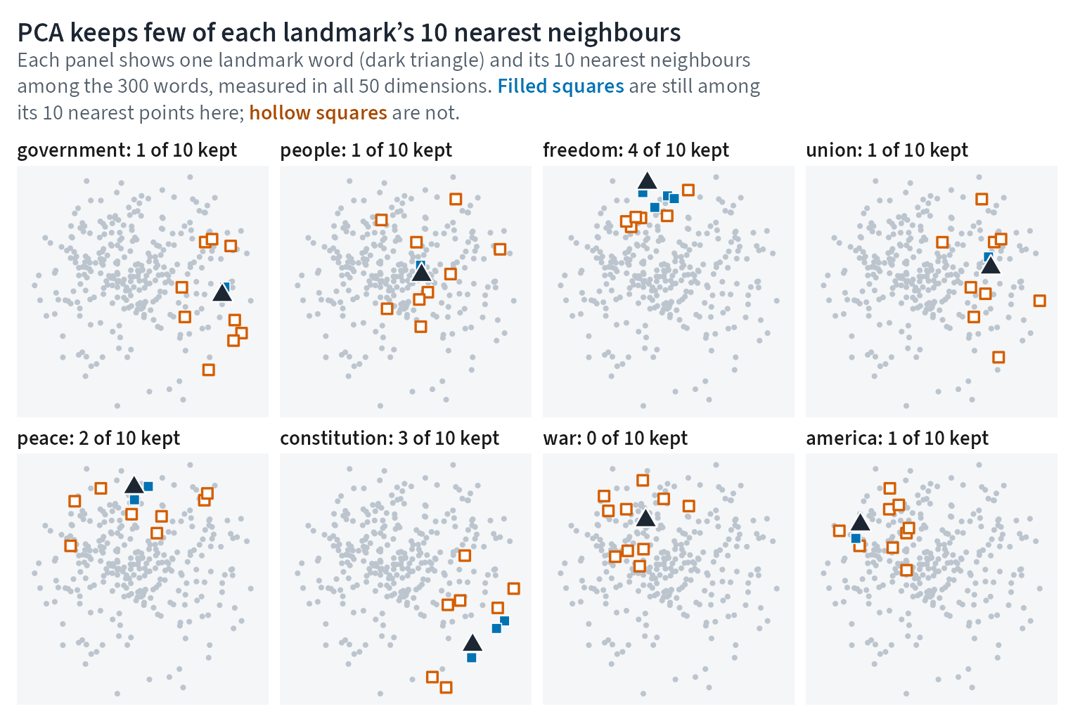
PCA axes can flip sign across software builds, so the code fixes the signs with named words before plotting. The plot has no axis labels because left, right, up, and down mean nothing here; only nearness inside a panel matters. Each panel title reports how many of the landmark’s 10 nearest neighbours stayed among its 10 nearest points in the drawing.
Project with t-SNE
t-SNE is a stochastic method that tries to keep local neighbours together in the drawing. It can also create groups and gaps that are not stable evidence. Here, perplexity 30 sets roughly how many neighbours each point considers; it is unrelated to the language-model perplexity in lessons 63 and 64. Theta 0.5 trades a little accuracy for speed, and 750 iterations is the number of optimization updates. The run also uses seed 7801, no initial PCA step, no extra normalization, and one thread.
run_tsne <- function(seed) {
  set.seed(seed)
  fit <- Rtsne(
    normalized_embeddings,
    dims = 2,
    perplexity = 30,
    theta = 0.5,
    max_iter = 750L,
    pca = FALSE,
    normalize = FALSE,
    check_duplicates = FALSE,
    num_threads = 1,
    verbose = FALSE
  )
  coordinates <- fit$Y
  rownames(coordinates) <- rownames(normalized_embeddings)
  coordinates
}

tsne_seed_7801 <- run_tsne(7801)
tsne_neighbours_7801 <- nearest_by_distance(tsne_seed_7801, 10L)
tsne_panels <- anchor_panels(tsne_seed_7801, tsne_neighbours_7801)
tsne_plot <- draw_projection(tsne_panels) +
labs(
title = "t-SNE keeps more neighbours close, but not all of them",
subtitle = key_subtitle
)
tsne_plot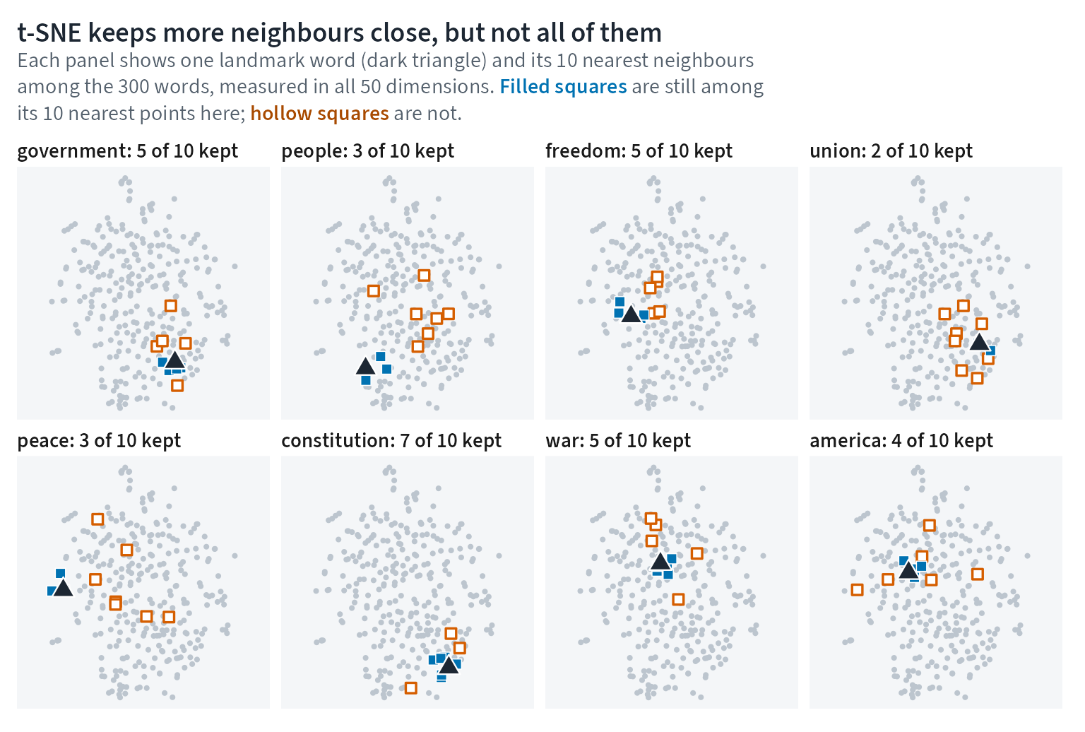
The panels hold the same landmarks as the PCA figure, so the two pictures can be compared by eye. The counts in the panel titles are the evidence; the shapes of the groups are not.
Measure neighbour preservation
A 10-nearest-neighbour preservation score averages the panel-title count over every plotted word, not just the eight landmarks, and divides by 10. Chance is 10 divided by 299, or 3.3%. A second t-SNE run with seed 7802 shows how much of the picture depends on the seed.
neighbour_overlap <- function(first, second) {
  mean(vapply(
    seq_len(nrow(first)),
    \(row) sum(first[row, ] %in% second[row, ]) / ncol(first),
    numeric(1)
  ))
}

tsne_seed_7802 <- run_tsne(7802)
tsne_neighbours_7802 <- nearest_by_distance(tsne_seed_7802, 10L)

preservation_table <- tibble(
  comparison = c(
    "PCA versus 50-dimensional neighbours",
    "t-SNE seed 7801 versus 50-dimensional neighbours",
    "t-SNE seed 7802 versus 50-dimensional neighbours",
    "t-SNE seed 7801 versus t-SNE seed 7802",
    "chance level for a random 10-word set"
  ),
  preservation = c(
    neighbour_overlap(full_space_neighbours, pca_neighbours),
    neighbour_overlap(full_space_neighbours, tsne_neighbours_7801),
    neighbour_overlap(full_space_neighbours, tsne_neighbours_7802),
    neighbour_overlap(tsne_neighbours_7801, tsne_neighbours_7802),
    10 / (nrow(normalized_embeddings) - 1)
  )
)| Comparison | Average 10-neighbour overlap |
|---|---|
| PCA versus 50-dimensional neighbours | 17.5% |
| t-SNE seed 7801 versus 50-dimensional neighbours | 43.1% |
| t-SNE seed 7802 versus 50-dimensional neighbours | 42.6% |
| t-SNE seed 7801 versus t-SNE seed 7802 | 50.8% |
| chance level for a random 10-word set | 3.3% |
The measured result is modest but useful. PCA keeps about 17.5% of each word’s 10 neighbours. The plotted t-SNE run keeps about 43.1%, and the second seed keeps about 42.6%. The two t-SNE runs agree with each other on about 50.8% of neighbours. That is well above chance, but it is not perfect stability.
Inspect labelled words as rows
The table below is the text alternative for the landmark panels. It lists neighbours from the full vector space and from the two plotted projections, so no one has to infer them from point positions.
neighbour_table <- tibble(word = label_words) |>
  mutate(
    full_space = map_chr(word, \(w) str_c(full_space_neighbours[w, 1:5], collapse = ", ")),
    pca_plot = map_chr(word, \(w) str_c(pca_neighbours[w, 1:5], collapse = ", ")),
    tsne_plot = map_chr(word, \(w) str_c(tsne_neighbours_7801[w, 1:5], collapse = ", "))
)| Landmark word | Nearest in 50 dimensions | Nearest in PCA plot | Nearest in t-SNE plot |
|---|---|---|---|
| government | principle, authority, system, action, laws | revenue, within, law, general, justice | constitutional, laws, authority, right, power |
| people | character, citizens, interests, honor, course | while, themselves, another, in, both | citizens, country, americans, fellow, honor |
| freedom | human, progress, yet, democracy, liberty | progress, peace, human, life, world | human, liberty, their, faith, our |
| union | system, federal, institutions, success, constitution | means, whole, or, of, national | system, general, within, foreign, policy |
| peace | world, prosperity, all, order, strong | toward, human, life, even, strength | world, nations, men, all, among |
| constitution | authority, executive, president, constitutional, congress | executive, duty, constitutional, united, proper | states, executive, authority, laws, powers |
| war | progress, still, force, old, yet | good, end, seek, greater, men | yet, made, end, progress, through |
| america | democracy, history, world, yet, hope | we, done, us, work, nothing | history, democracy, experience, way, spirit |
If a nearby label looks interesting, the next step is to read the texts or the neighbour table. The picture alone is not evidence that the words form a topic.
What this does not show
The t-SNE plot does not give meaningful cluster sizes, gap sizes, group positions, or axis directions. PCA directions are mathematical summaries, but their signs can flip, and this plot still leaves most of the variance out.
The preservation scores describe how faithfully the projection draws this small model, not how faithfully the model captures meaning. Small-corpus embeddings can change their neighbour lists when trained again, which is why this model is pinned. The same t-SNE seed can also draw a different layout on another computer, because low-level numerical details can differ, so every count on this page is computed during the render.
What to remember
- Each plotted point began as a 50-number word vector.
- Rows were scaled to length 1 before PCA and t-SNE, so distance in the 50-dimensional space ranks neighbours the same way as cosine similarity; a projection can still change that order.
- PCA’s first two components explain about 23.9% of the variance here.
- Mark kept and lost neighbours in the plot instead of trusting how groups look.
- t-SNE preserves more local neighbours than PCA in this run, but two seeds still disagree on many neighbours.
- Do not interpret clusters, gaps, sizes, positions, or axis directions as findings.
Keep the scatterplot beside the preservation table. The table says what the picture kept.