library(dplyr)
library(tidyr)
library(tibble)
library(stringr)
library(tidytext)
library(ggplot2)
library(ggwordcloud)
library(purrr)

source("R/inaugural-corpus.R")
source("R/lesson-figures.R")

paragraphs <- inaugural_paragraphs()

all_word_tokens <- paragraphs |>
  select(paragraph_id, speech_id, paragraph) |>
  unnest_tokens(word, paragraph)

dropped_by_letters_filter <- all_word_tokens |>
  filter(!str_detect(word, "^[a-z]+$"))

word_tokens <- all_word_tokens |>
  filter(str_detect(word, "^[a-z]+$"))

onix_stop_words <- stop_words |>
  filter(lexicon == "onix") |>
  distinct(word)

inaugural_word_counts <- word_tokens |>
  anti_join(onix_stop_words, by = join_by(word)) |>
  count(word, sort = TRUE, name = "count") |>
  mutate(letters = str_length(word))

cloud_words <- inaugural_word_counts |>
slice_head(n = 22)Reading a word cloud carefully
Compare the picture with the count table that made it
information visualization
word clouds
inaugural addresses
Learn how word clouds encode word counts, why the layout can mislead, and how to check the same words in a sorted bar chart and table.
Twenty-two words can fill Iris’s slide about the inaugural addresses. The table behind the picture matters more than the shape of the picture itself.
The tempting part is also the risk. A large word can mean a high count, a long spelling, or a lucky position in the packing algorithm.
Word clouds draw words from a count table with larger type for larger counts. They are useful for a quick look at a vocabulary. They are weak for exact comparisons, rank order, meaning, and change over time.
TipWhat you will learn
This lesson shows how to:
- build one corpus-wide word-count table from inaugural paragraphs;
- use a named stop-word list and check what it removes;
- draw a sorted bar chart and a word cloud from the same counts;
- read size, position, and colour in a cloud honestly;
- test the word-length trap with real words from the data; and
- give the cloud a two-part text alternative.
Build one count table
The corpus helper returns one row per paragraph. This lesson asks one corpus-wide question: after a stated cleanup, which words occur most often across all inaugural paragraphs? Pooling every paragraph gives long speeches more weight than short ones, so the result is a preview of the vocabulary, not a claim about importance.
The figures use the site’s shared style, theme_lesson(), from R/lesson-figures.R. That keeps the plotting code below focused on the choices that belong to each chart.
| Word | Count | Letters |
|---|---|---|
| government | 585 | 10 |
| people | 561 | 6 |
| so | 384 | 2 |
| country | 306 | 7 |
| world | 305 | 5 |
| nation | 299 | 6 |
| citizens | 242 | 8 |
| own | 242 | 3 |
| peace | 240 | 5 |
| power | 240 | 5 |
| public | 224 | 6 |
| time | 214 | 4 |
| constitution | 207 | 12 |
| united | 198 | 6 |
| nations | 195 | 7 |
| union | 188 | 5 |
| free | 179 | 4 |
| freedom | 175 | 7 |
| war | 174 | 3 |
| america | 166 | 7 |
| american | 160 | 8 |
| national | 157 | 8 |
The onix list removes states but keeps united, so a phrase such as United States can leave united standing alone. A different stop-word list would produce a different table.
unnest_tokens() lowercases the paragraphs and splits punctuation away from words, except an apostrophe inside a word. The ^[a-z]+$ filter then keeps only tokens made entirely of letters, so it drops whole tokens such as america's; in this corpus it drops 367 tokens. After that filter, so survives 384 times because onix does not list it as a stop word.
Show the counts before the cloud
A sorted bar chart puts the same words on a common scale. People compare positions along a common scale more accurately than areas, so the chart is the check Iris should read before the cloud. Cleveland and McGill placed area below position in their hypothesized ranking of graphical perception tasks; they did not test word clouds themselves.
Each bar carries its count as a label, so the chart needs no numeric axis. The one highlighted bar is the stop-word decision the reader should notice.
bar_data <- cloud_words |>
  mutate(
    kept_by_onix = word == "so",
    bar_label = if_else(
      kept_by_onix,
      str_c(count, ", not an onix stop word"),
      as.character(count)
    )
  )

bar_plot <- ggplot(bar_data, aes(x = count, y = reorder(word, count))) +
  geom_col(aes(fill = kept_by_onix), width = 0.72, show.legend = FALSE) +
  geom_text(
    aes(label = bar_label),
    hjust = 0,
    nudge_x = 6,
    family = lesson_font,
    size = 9.5,
    size.unit = "pt",
    colour = lesson_colours[["body"]]
  ) +
  scale_fill_manual(
    values = c(
      `FALSE` = lesson_colours[["accent"]],
      `TRUE` = lesson_colours[["contrast"]]
    )
  ) +
  scale_x_continuous(expand = expansion(mult = c(0, 0.32))) +
  labs(
    title = "Two words lead the count by a wide margin",
    subtitle = "Uses in 1,377 inaugural paragraphs after removing onix stop words",
    x = NULL,
    y = NULL
  ) +
  theme_lesson(grid = "none") +
  theme(axis.text.x = element_blank())

bar_plot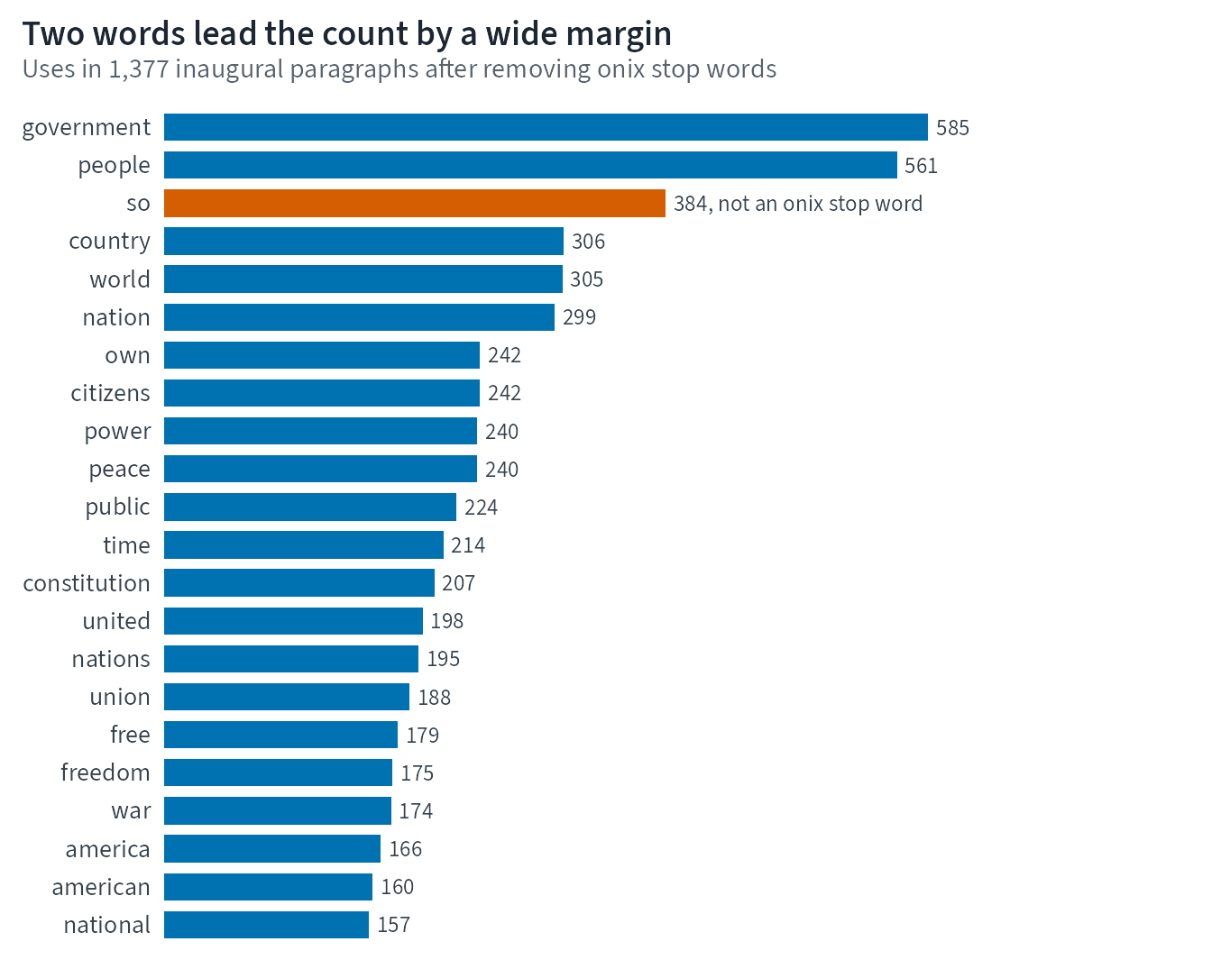
The bar chart and the table use the same word and count values. Nothing about a word’s position in the cloud below is evidence of a relationship between words.
Draw the same counts as a cloud
The cloud below uses geom_text_wordcloud() with one colour and no rotation. scale_size_area() sets the type size so that the area of each letter grows in step with the count: a word used four times as often gets letters twice as tall. The scale does nothing about word length, so a long word with a modest count can still cover more of the slide than a short word used more often.
draw_cloud <- function(seed) {
  ggplot(cloud_words, aes(label = word, size = count)) +
    # ggwordcloud places each word by first measuring it on a grDevices::png()
    # device. These figures are drawn on that same device, with its default
    # font, so each word is drawn exactly as wide as it was measured.
    geom_text_wordcloud(
      seed = seed,
      colour = lesson_colours[["accent"]],
      angle = 0,
      grid_margin = 2,
      rm_outside = FALSE
    ) +
    scale_size_area(max_size = 16, guide = "none") +
    theme_lesson(grid = "none", base_family = "sans")
}

cloud_plot_seed_7701 <- draw_cloud(seed = 7701) +
  labs(
    title = "The first word drawn takes the centre",
    subtitle = "Type size follows the count. Position, neighbours, and colour carry no meaning."
  )

cloud_plot_seed_7701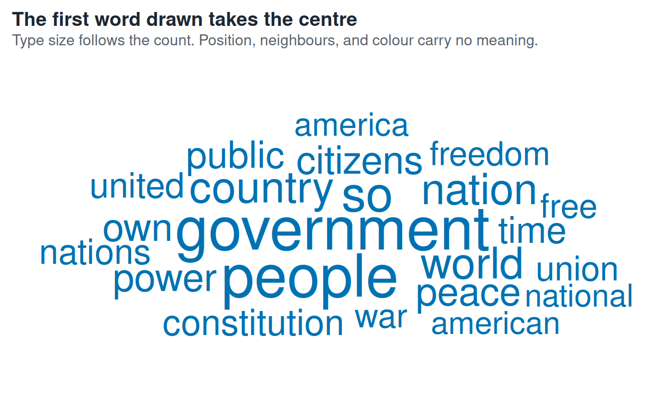
The word in the middle is the first row drawn, not the topic of the speeches. The table is sorted by count, so government is drawn first. If the table were alphabetical, a different word could start in the centre. The packing also depends on the seed, the drawing device, and the fonts, so the page makes no claim about where any word should sit.
area_corr, an option in ggwordcloud, makes a different trade. It resizes labels so each word’s whole text box follows the count, which removes the length bias but gives short words taller type. Felix, Franconeri, and Bertini later found that people judged values more accurately from bar length than from font size.
The short part of the text alternative is the cloud’s alt text: “Word cloud of the same 22 words from the count table. The largest words are government, used 585 times, and people, used 561 times; the positions of the words are not data. The count table above is the long text alternative.” The long part is the sorted count table above, which lists every word and count used in the cloud.
Change the seed, not the data
The next cloud calls the same function with a different layout seed. The counts are unchanged.
cloud_plot_seed_7702 <- draw_cloud(seed = 7702) +
  labs(
    title = "A new seed moves every word; the counts stay the same",
    subtitle = "Same 22 words and counts as the previous cloud, layout seed 7702"
  )

cloud_plot_seed_7702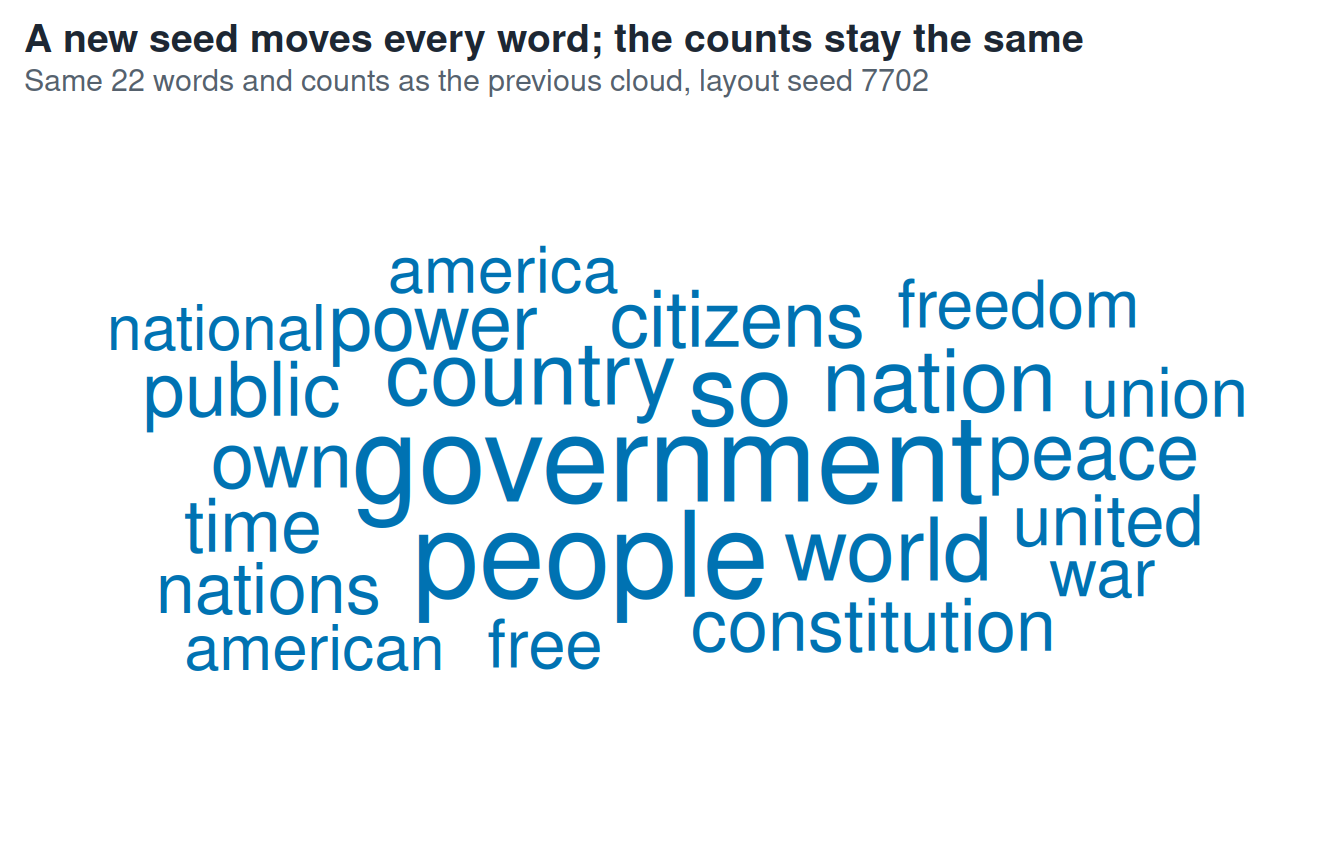
If the two pictures feel different, that feeling is the warning. The counts did not change.
Check preprocessing sensitivity
Stop-word lists are editorial choices. The table below recomputes the top ten words under three named choices: onix only, snowball only, and all three tidytext lists together.
stopword_choices <- list(
  "onix only" = stop_words |>
    filter(lexicon == "onix") |>
    distinct(word),
  "snowball only" = stop_words |>
    filter(lexicon == "snowball") |>
    distinct(word),
  "all tidytext lexicons" = stop_words |>
    distinct(word)
)

sensitivity_table <- imap(
  stopword_choices,
  \(stop_table, stop_choice) {
    word_tokens |>
      anti_join(stop_table, by = join_by(word)) |>
      count(word, sort = TRUE, name = "count") |>
      slice_head(n = 10) |>
      mutate(stop_choice = stop_choice, rank = row_number(), .before = 1)
  }
) |>
list_rbind()| Rank | Onix only | Snowball only | All tidytext lexicons |
|---|---|---|---|
| 1 | government (585) | will (940) | government (585) |
| 2 | people (561) | government (585) | people (561) |
| 3 | so (384) | people (561) | country (306) |
| 4 | country (306) | us (468) | world (305) |
| 5 | world (305) | can (456) | nation (299) |
| 6 | nation (299) | upon (369) | citizens (242) |
| 7 | citizens (242) | must (359) | peace (240) |
| 8 | own (242) | great (342) | power (240) |
| 9 | peace (240) | states (331) | public (224) |
| 10 | power (240) | may (326) | time (214) |
With snowball only, common words such as will, us, and states remain. With onix, states is removed while united remains. A cloud without this preprocessing note would look more objective than it is.
Check the word-length trap
The next table compares real words from the count table. The rough space score is letters * sqrt(count). It is not a model of perception; it only shows why a long word can take more horizontal room even when its count is lower. Alexander and coauthors tested word-length effects in word clouds directly.
length_pairs <- inaugural_word_counts |>
  filter(word %in% c("constitution", "time", "peace", "government", "people")) |>
  mutate(rough_horizontal_space = round(letters * sqrt(count), 1)) |>
arrange(desc(rough_horizontal_space))| Word | Count | Letters | Rough space score |
|---|---|---|---|
| government | 585 | 10 | 241.9 |
| constitution | 207 | 12 | 172.6 |
| people | 561 | 6 | 142.1 |
| peace | 240 | 5 | 77.5 |
| time | 214 | 4 | 58.5 |
constitution appears 207 times and time appears 214 times. The longer word can still take about 3 times the horizontal space under this simple geometry check. That is why Iris should not ask readers to compare close counts from font size.
What this cloud does not show
The cloud does not show word order, phrases, relationships, distinctiveness, change over time, or importance. It also hides that united and states were once part of a phrase before tokenizing and the stop-word list split them.
Use a cloud as a doorway to the table, not as the table’s replacement.
What to remember
- A word cloud starts from a count table; keep that table visible.
- The onix stop-word list removes
statesbut keepsunitedin this corpus. - The bar chart and both clouds here use the same 22 counts.
- Placement, neighbours, the centre, and colour in a cloud carry no meaning.
- Long words can look stronger than shorter words with similar counts.
- The sorted counts are the long text alternative for the cloud.
Iris keeps the cloud, but the slide title points to the count table: “Common words after one stated cleanup.”
Sources
- ggwordcloud vignette
- tidytext stop-word documentation
- Cleveland and McGill on graphical perception
- Heer and Bostock on crowdsourced graphical perception
- Alexander et al. on word-length effects in word clouds
- Felix, Franconeri, and Bertini on word-cloud magnitude judgments
- Hearst and Rosner on tag-cloud limits
- W3C guidance on complex image text alternatives